CASE STUDY
Cadáver Esquisito Design Agency
Portuguese design agency wins a number of awards for their ludacris illustrations printed onto beer labels.
Joao Brazao of Cadaver Esquisito drank a beer from Northern Monk when he noticed the stand-out labels that CS produced. These labels were more than just your standard beer labels and this sparked an idea for huge potential which would allow Joao and his team to add more content to beer labels.
After checking with current label suppliers, Joao and his design team quickly realised that the idea they had for the label was not achievable. This meant that the team began researching Northern Monk before eventually discovering CS labels and at this point, the team knew from the start that this was the perfect partnership for them.
Cadáver Esquisito's Awards
D&AD International Design Competition
- Wood Pencil Award for Illustration & Packaging
- Shortlist for Illustration / Integrated
Festival Clube Criativos de Portugal 2022
- Gold Medal for Best Illustration
- Gold Medal for Best Label
- Silver Medal for Logo Branding
- Silver Medal for Editorial Illustration
- Bronze Medal for Branding
- Bronze Medal for Photography
What CS Labels achieved
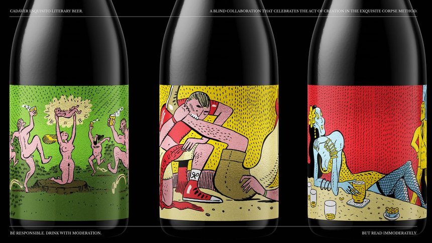
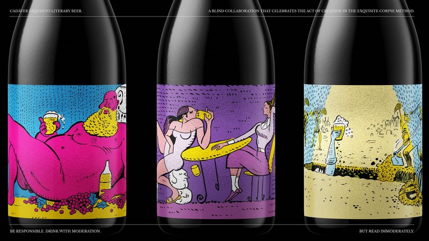
- 6 Label Designs - Small batch order of 300 labels for each design
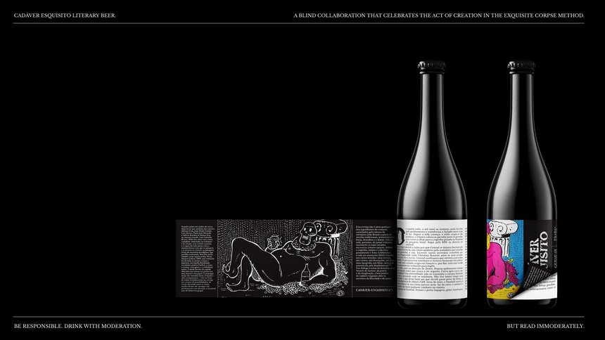
- Peel and Reveal label but with middle page
- Black and White monochrome middle page and bottom page
- 2nd page is a mirror of the top-level label but in black and white monochrome.
- Metallic top-level page
Using a metallic substrate for the front layer of the label gave additional colour and brightness that the label would have missed had it been printed using white PP. Digitally printing the labels, meant we had the flexibility to work with small batch quantities. The labels were also printed on the Xeikon CX3 press using food-safe toner.
We reached out to Joao at Cadáver Esquisito after hearing about the award nominations and asked him a number of questions about his experience with CS Labels.
"From the moment we decided to contact CS Labels and sent the first email, the communication was always very responsive and, on top of that, we were told to use a label with a metallic finish that turned out to be the best choice to highlight the work we did. We were also a bit time pressured, and CS Labels delivered everything on time taking into consideration our needs.
Everything was very smooth. We only were in contact via email but it ended up being very effective as the answers to our questions were always timely. Our contact with CS Labels went on vacation during the processes but assigned an alternative contact to us that was equally responsive and kept everything in motion.
We were given several choices on the label finishing. We were a bit unsure of what would be the best option and we've asked for a suggestion. CS Labels analyzed our design and suggested a metallic finish, In the words of our illustrator it was an amazing option that highlighted the details of each illustration."
What CS Labels achieved
- 6 Label Designs - Small batch order of 300 labels for each design
- Peel and Reveal label but with middle page
- Black and White monochrome middle page and bottom page
- 2nd page is a mirror of the top-level label but in black and white monochrome.
- Metallic top-level page
Using a metallic substrate for the front layer of the label gave additional colour and brightness that the label would have missed had it been printed using white PP. Digitally printing the labels, meant we had the flexibility to work with small batch quantities. The labels were also printed on the Xeikon CX3 press using food-safe toner.
How Can CS Labels Make Your Product Stand Out?
We’ve been printing labels for over 40 years
Saving Time, Reducing Waste, Saving Money.
